One UI 8.5 Beta’s Striking iOS Resemblance on Samsung Phones
The release of the One UI 8.5 beta has ignited considerable discussion among Samsung enthusiasts and the broader Android community. While lauded for its enhanced customization and refined application suite, a prevailing sentiment has emerged: the user interface, in many aspects, exhibits a striking resemblance to Apple’s iOS. This observation is not merely superficial; a deeper dive into the beta reveals numerous design choices and functional implementations that echo the iPhone experience, leading some to suggest that the One UI 8.5 beta’s striking iOS resemblance on Samsung phones marks a significant pivot in Samsung’s design philosophy. This article explores the various facets of this transformation, analyzing the specific UI elements that contribute to this perception, the potential motivations behind Samsung’s decisions, and the implications for both users and the competitive smartphone landscape.
For years, Android and iOS have carved out distinct identities, offering users divergent approaches to mobile computing. Android, particularly through Samsung’s One UI, has often championed extensive customization, open-ended functionality, and a more granular control over the device. iOS, conversely, has been synonymous with polished simplicity, intuitive gestures, and a tightly integrated ecosystem. The current iteration of the One UI 8.5 beta appears to be blurring these lines, adopting conventions that have long been hallmarks of Apple’s mobile operating system. This convergence raises questions about brand identity, user expectations, and the future direction of smartphone interface design.
The Unmistakable iOS Influence in One UI 8.5
Upon first interaction with the One UI 8.5 beta, many users will immediately notice a shift in aesthetic and interaction patterns that feel distinctly Apple-esque. This isn’t just a coincidence; it’s a series of deliberate design choices that collectively contribute to the perception that the One UI 8.5 beta’s striking iOS resemblance on Samsung phones is more than skin deep. From the layout of critical system panels to the visual language of core applications, the echoes of iOS are pervasive.
Quick Settings and Control Center Parallels
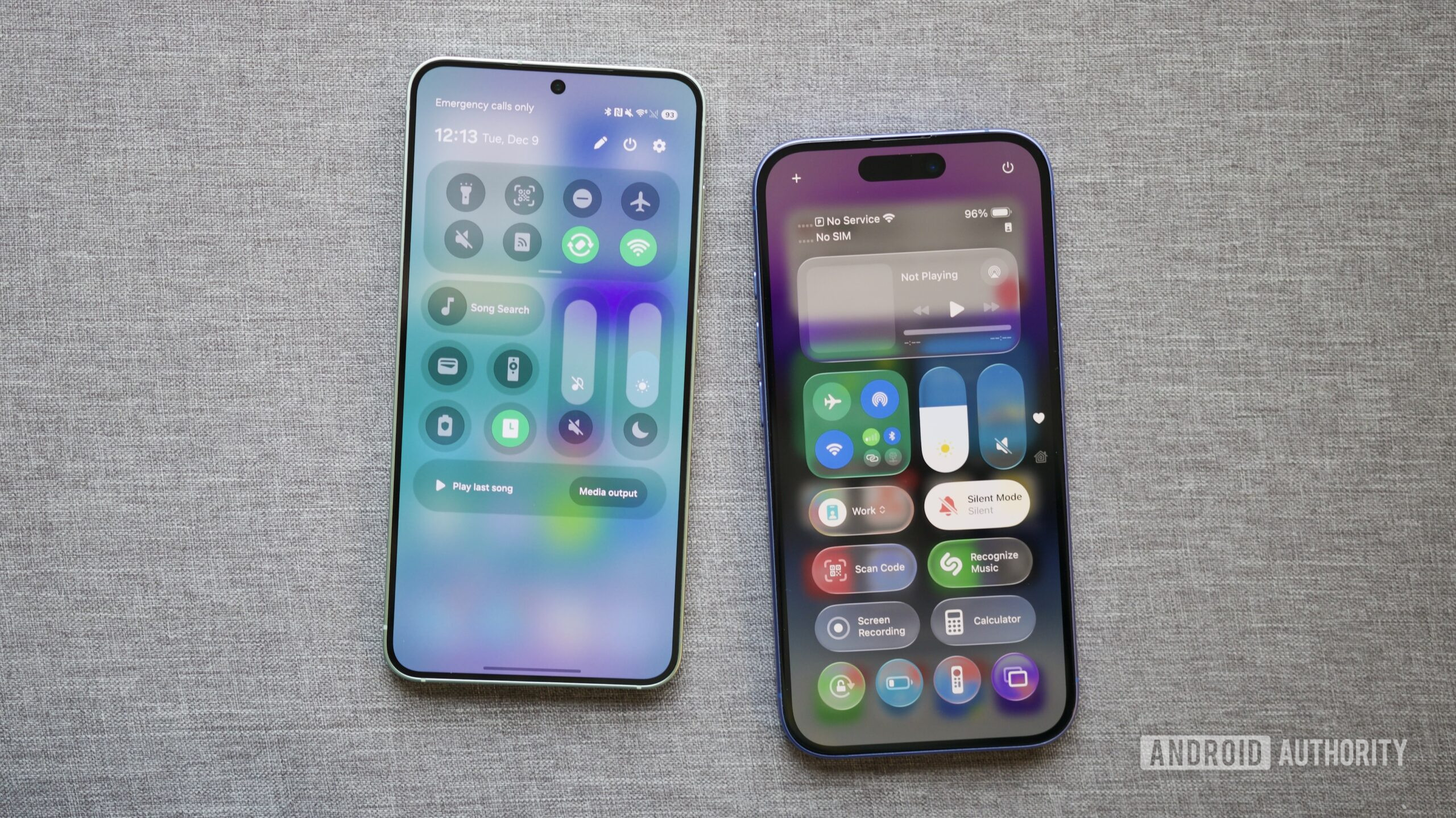
One of the most immediate and impactful changes in One UI 8.5 is the revamped Quick Settings interface. While previous versions offered some customization, the beta introduces an unprecedented level of control, allowing users to separate brightness and volume sliders and add individual controls with greater flexibility. Crucially, these sliders can now be oriented vertically, mimicking the vertical sliders found in Apple’s Control Center. This seemingly minor adjustment, when combined with similar icon shapes and the prominent grab bars in edit mode, creates a visual and functional experience that is uncannily familiar to iPhone users. The ability to quickly access and adjust frequently used settings, while highly convenient, now carries a distinct iOS flavor, fundamentally altering a long-standing Android staple.
Beyond the sliders, the overall organization of the Quick Settings panel, with its distinct toggles and quick access shortcuts, feels more structured and less ‘dense’ than previous One UI iterations. This streamlined approach, while arguably more user-friendly for some, aligns closely with the design principles that Apple has long employed to ensure ease of access and visual clarity. The changes reflect a move towards a more curated and perhaps less overwhelming user experience, which is a common characteristic of iOS.
Visual Cues and Iconography
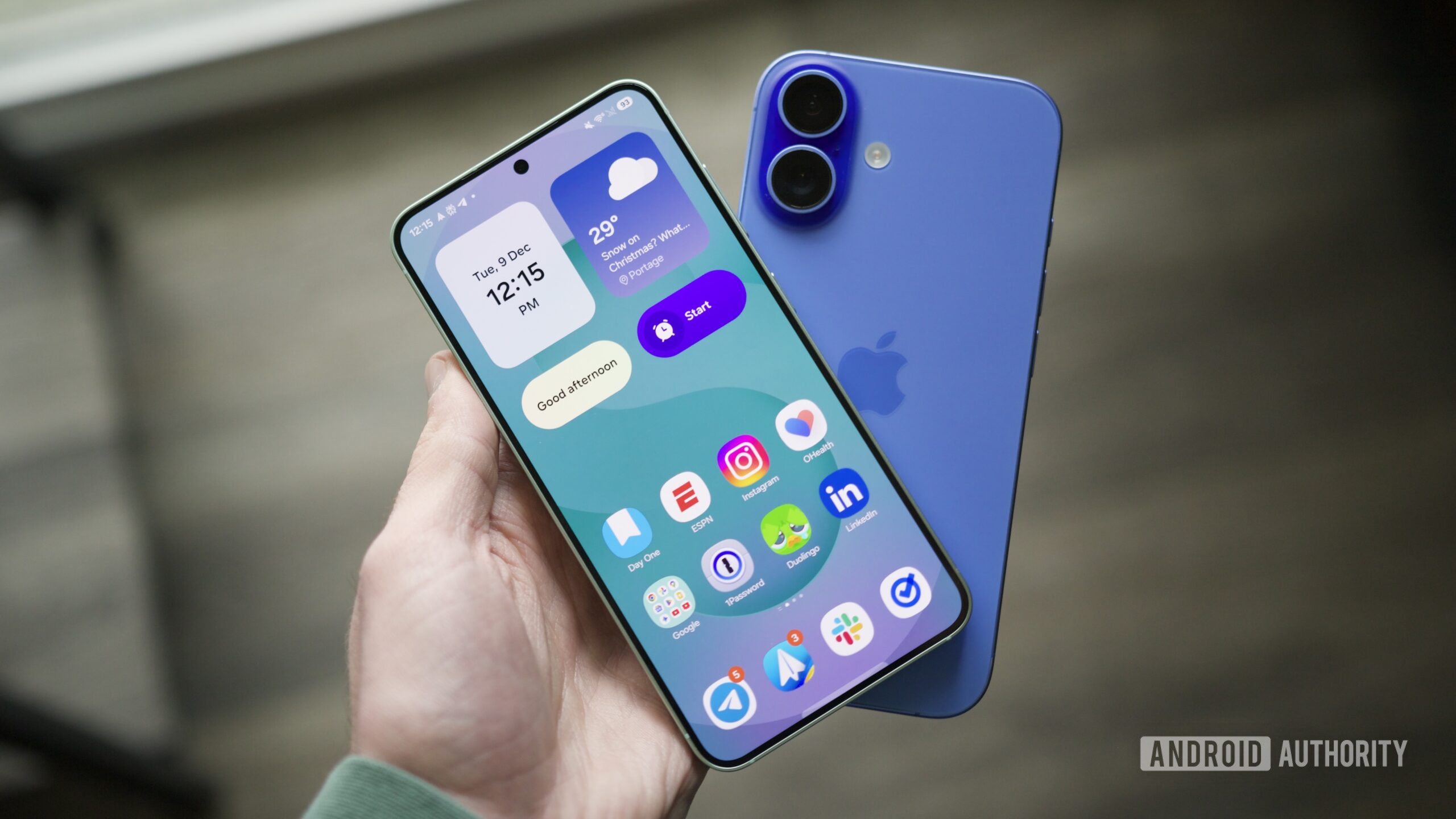
The visual language extends beyond just the Quick Settings. Iconography, system animations, and even the typography in certain areas of the One UI 8.5 beta seem to have adopted a softer, more rounded, and minimalist aesthetic that is reminiscent of iOS. While Samsung has always had its own design language, the latest beta introduces elements that suggest a convergence. For instance, the shape and shading of app icons, particularly for system applications, appear to be moving towards a more uniform and ‘squircle’ design, a shape famously associated with Apple’s icon grid. This subtle shift in visual cues contributes significantly to the overall ‘feel’ of the interface, making it feel less like a traditional Android skin and more like a refined, cross-platform experience.
Furthermore, the haptic feedback and transition animations during app switching or system interactions also seem to have been refined to offer a smoother, more fluid experience, similar to the polished animations found in iOS. These subtle yet impactful details play a crucial role in how users perceive the responsiveness and premium feel of a device. The cumulative effect of these visual and interactive changes is a user experience that, for better or worse, feels increasingly like interacting with an iPhone.
App Design Language (Clock, Phone apps)
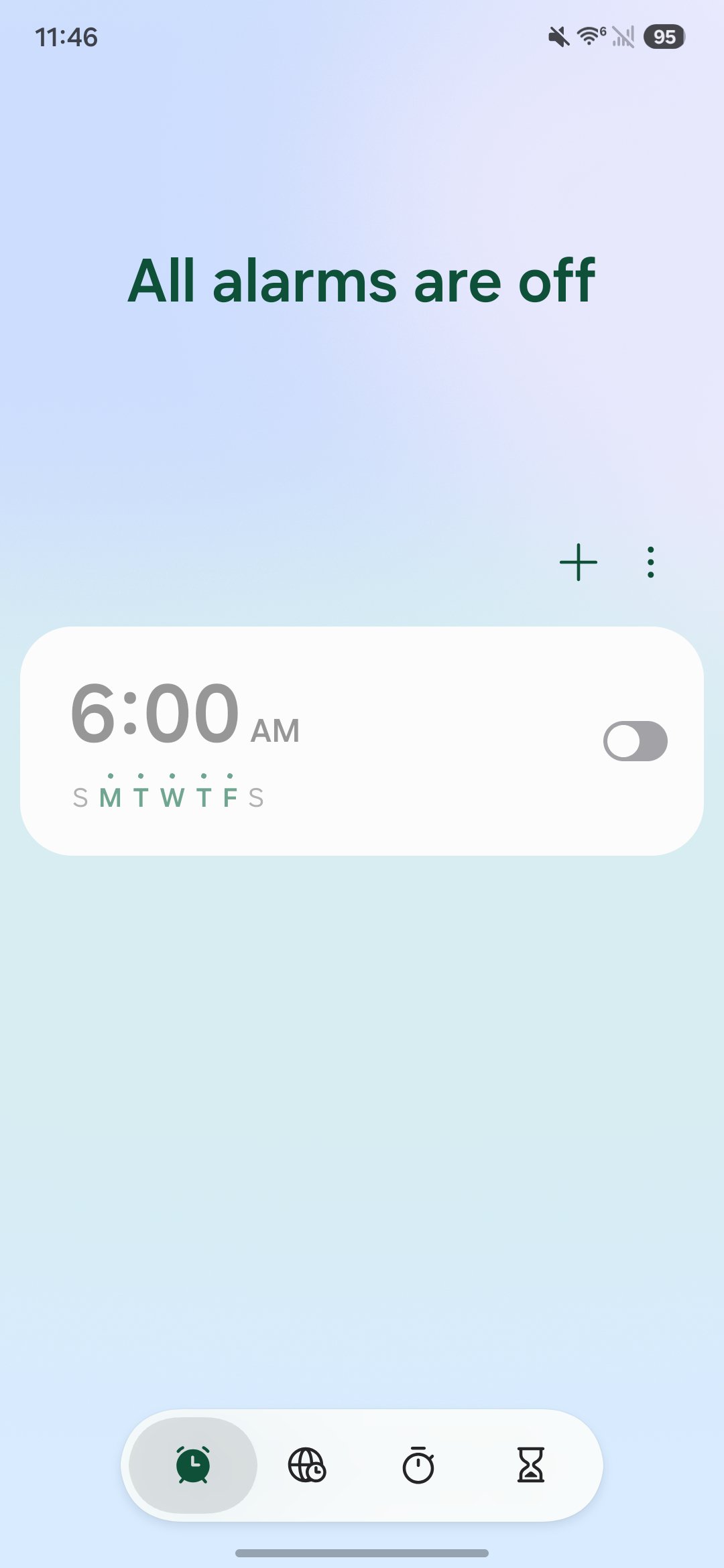
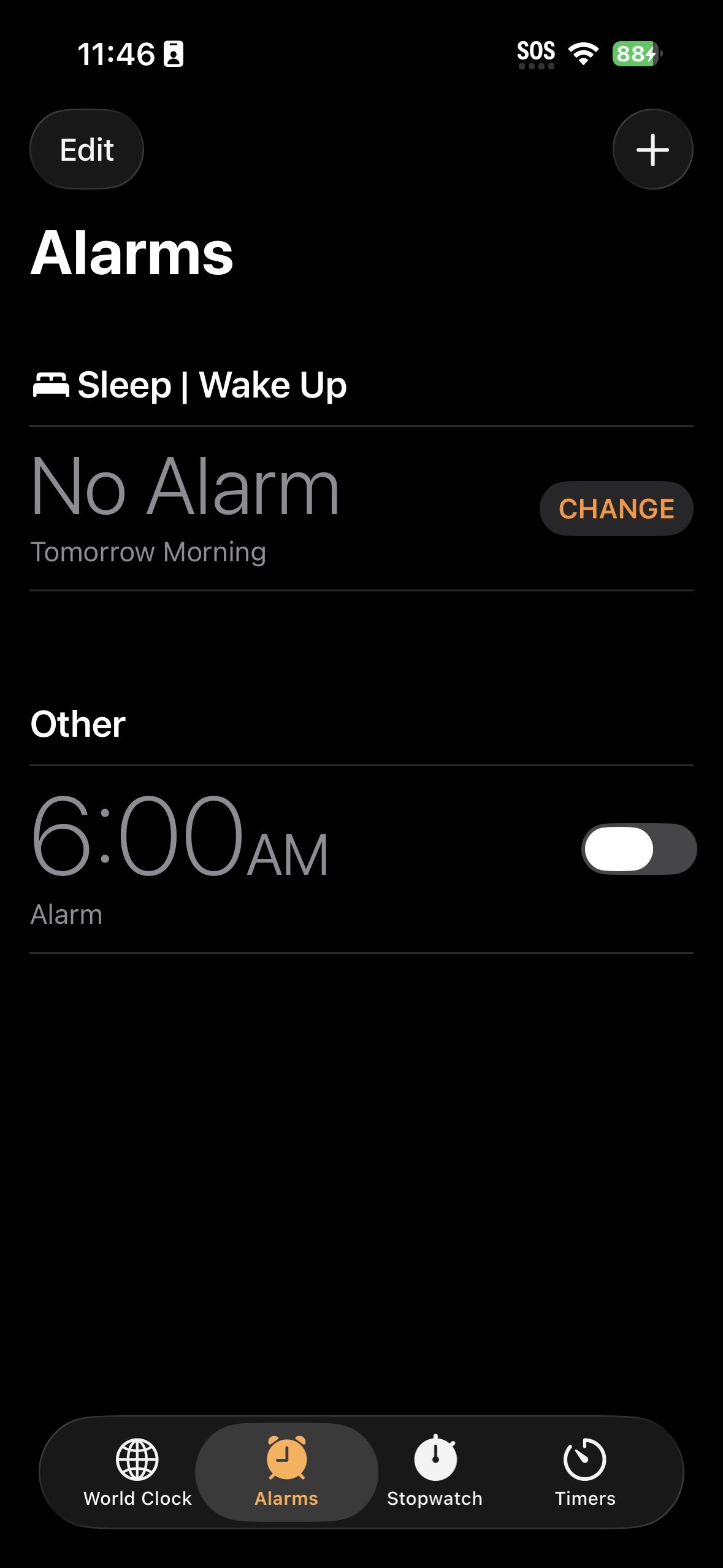
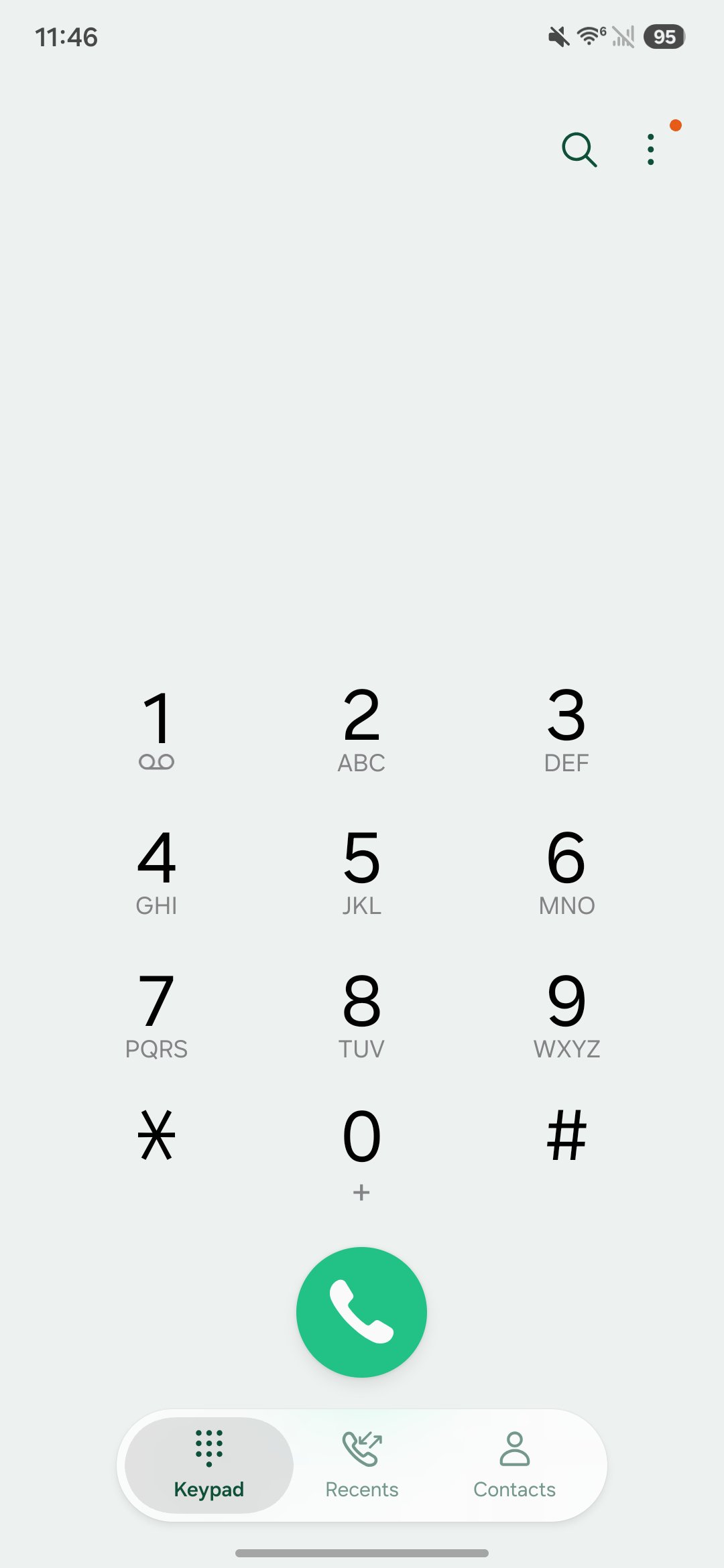
Core applications within the One UI 8.5 beta also display significant stylistic similarities to their iOS counterparts. The Clock app, for example, features a layout and color scheme that bears a strong resemblance to Apple’s native Clock application, particularly in its world clock and alarm sections. The use of bold, clear typography, combined with minimalist controls and a clean background, evokes a sense of familiarity for anyone accustomed to iOS. Similarly, the Phone app has seen adjustments that align it more closely with the iPhone’s dialer and contact interface, prioritizing large, easily tappable buttons and a straightforward layout.
These changes extend to other default apps as well, suggesting a concerted effort by Samsung to refine its app ecosystem with a consistent, modern, and perhaps universally appealing design language. While this could be seen as a move towards greater user accessibility and aesthetic coherence, it undeniably leans into a style that Apple has popularized. The goal might be to create a more intuitive experience for users migrating from iOS or to simply adopt what is perceived as a successful and widely accepted design paradigm in the mobile industry. Regardless of the intent, the result is a One UI that feels distinctively different from its predecessors and surprisingly close to its Cupertino rival.
Deep Dive into Specific UI Elements and Interactions
Beyond the initial visual impressions, the One UI 8.5 beta incorporates several interaction models and specific UI elements that further solidify its resemblance to iOS. These granular changes, often overlooked individually, coalesce to create a holistic user experience that feels remarkably similar.
Navigation Gestures and Haptic Feedback
Navigation gestures have become the standard for modern smartphones, and both Android and iOS have evolved their implementations. In One UI 8.5, the fluidity and responsiveness of gestures, particularly for returning to the home screen or switching between apps, feel more refined and closer to the smooth, predictable animations found on iPhones. The haptic feedback accompanying these gestures also appears to have been tuned for a more subtle yet crisp response, similar to the precise haptics Apple is known for. This combination of visual fluidity and tactile confirmation contributes significantly to the premium feel and ease of use, aligning with the “it just works” philosophy often attributed to Apple products.
The swipe-up-and-hold gesture for multitasking, the swipe from the bottom to go home, and the swipe from the sides to go back are all common across both platforms. However, the exact timing, animation curves, and accompanying haptic responses in One UI 8.5 beta feel particularly polished in a way that resonates with the iOS experience. This is a critical area where user experience is directly impacted, and Samsung’s refinements here suggest an aim for universal intuitiveness, even if it means drawing inspiration from a competitor.
Lock Screen and Notification Center Evolution
The lock screen and notification center are daily interaction points for every smartphone user. One UI 8.5 introduces customizations and layouts that bring these elements closer to iOS. For instance, the ability to customize the lock screen with different clock styles, widgets, and notification displays, while offering more freedom than iOS in some regards, draws parallels to the personalization options introduced in recent iOS versions. The way notifications stack and are dismissed, and the quick access to camera and flashlight from the lock screen, also show a convergence in design principles.
The notification shade itself, with its clearer separation of quick toggles and incoming alerts, feels less cluttered and more organized. This improved clarity and visual hierarchy are qualities often praised in iOS’s notification management. Samsung’s efforts here aim to reduce information overload and make the notification experience more manageable and visually appealing, a design goal shared by Apple.
The Customization Paradox: Freedom vs. Familiarity
Historically, Android has been synonymous with unparalleled customization, offering users deep control over almost every aspect of their device. One UI, while providing a rich set of options, has always been Samsung’s interpretation of Android’s flexibility. With One UI 8.5, the paradox emerges: while the beta *enhances* customization in some areas (like Quick Settings), it simultaneously steers the overall aesthetic and interaction patterns towards a more familiar, iOS-like framework. This raises an interesting question: is Samsung leveraging customization to allow users to *make* their phone look like an iPhone, or is it simply adopting what it perceives as best practices in mobile UI design, which happen to have been pioneered or popularized by Apple?
The answer likely lies somewhere in between. By offering robust tools, Samsung allows users to personalize their experience, but the default settings and underlying design language now guide users towards an aesthetic that shares striking similarities with Apple’s platform. This could be a strategic move to appeal to a broader audience, including those considering switching from iOS, by offering a familiar entry point while retaining Android’s core flexibility. The balance between offering freedom and providing a guided, polished experience is a delicate one, and One UI 8.5 appears to be navigating this by providing both extensive customization options and a default experience that feels universally polished.
User Perception and Community Reactions
The changes in One UI 8.5 have not gone unnoticed, sparking a range of reactions from the Samsung and Android communities. The debate often centers on whether this convergence is a positive evolution or a step away from Android’s core identity.
The Divide: Android Purists vs. Cross-Platform Enthusiasts
Android purists and long-time Samsung users often express concern over the perceived “iOS-ification” of One UI. For them, the appeal of Android lies in its distinct identity, its open nature, and its departure from Apple’s walled garden. They value the unique visual and functional elements that differentiate Android skins like One UI. The idea that their Samsung phone is starting to feel like an iPhone can be disheartening, as it implies a loss of that unique Android flair. This segment of users often prefers innovation that expands Android’s distinct capabilities rather than adopting features or aesthetics from rival platforms.
On the other hand, cross-platform enthusiasts and users who frequently switch between Android and iOS might welcome the changes. A more unified design language across platforms could reduce the learning curve when switching devices, making the transition smoother. For users who appreciate the polish and simplicity of iOS but prefer the hardware or specific features of Samsung phones, the One UI 8.5 beta’s striking iOS resemblance on Samsung phones could be seen as the best of both worlds. This group often prioritizes a seamless, intuitive experience above strict platform differentiation.
Advantages of a Unified Aesthetic
There are clear advantages to adopting a more unified and polished aesthetic. A cleaner, more intuitive interface can improve usability for a wider audience, including those new to smartphones. Consistency in design across different brands can also make app development easier and ensure a more cohesive ecosystem. If certain UI patterns are proven to be highly effective and user-friendly, it makes sense for other platforms to adopt them, regardless of their origin. This approach can lead to a generally higher standard of mobile user experience across the industry.
Furthermore, by offering an experience that feels familiar to iOS users, Samsung could potentially attract a segment of the market that might otherwise be hesitant to switch to Android. This strategic move could broaden Samsung’s appeal and strengthen its position in the premium smartphone segment, where Apple has traditionally held a strong lead. The goal may not be to become an iPhone, but to offer an equally polished and intuitive experience that doesn’t alienate potential switchers.
Potential Pitfalls of Homogenization
However, the risk of homogenization is real. If all smartphone interfaces begin to look and feel the same, it diminishes brand identity and reduces genuine innovation in UI/UX design. What makes a Samsung phone distinct from an iPhone, beyond the hardware, could become less clear. This could lead to a less vibrant and diverse mobile ecosystem, where choices are primarily based on hardware specifications rather than unique software experiences. Users might also feel that their choices are limited if major platforms converge too closely.
Another pitfall is the potential for alienating loyal Android users who specifically chose Samsung for its unique take on the Android experience. While new users might be attracted, existing customers might feel that their preferred platform is losing its character. Striking the right balance between adopting popular design trends and retaining a distinct identity is a significant challenge for any major tech company.
Technical Underpinnings and Implementation
Achieving a nuanced UI transformation like the One UI 8.5 beta’s striking iOS resemblance on Samsung phones involves significant technical effort. It’s not just about changing colors or icons; it requires a deep understanding of design principles and careful implementation at a code level.
How Samsung Achieves the iOS Look
Samsung’s ability to create an iOS-like experience stems from several technical and design strategies. Firstly, they likely employ a robust design system that allows for consistent application of new visual styles across the entire UI. This includes updated guidelines for typography, color palettes, spacing, iconography, and animation curves. By systematically applying these new rules, Samsung can transform the look and feel of One UI without necessarily rebuilding it from scratch.
Secondly, the use of vector graphics and scalable UI elements ensures that the new aesthetic looks sharp and consistent across various screen sizes and resolutions. Advanced animation frameworks are likely used to achieve the fluid and responsive transitions that mimic iOS’s signature smoothness. Furthermore, the underlying Android framework provides a flexible canvas for customization, allowing Samsung to heavily modify the default Android Open Source Project (AOSP) interface to create its unique (or in this case, uniquely familiar) vision. This level of deep integration and customization is a hallmark of Samsung’s One UI development.
Performance and Stability in the Beta
Despite the significant UI overhaul, early reports from the One UI 8.5 beta suggest a generally stable and performant experience. This indicates that Samsung has put considerable effort into optimizing the new animations and visual effects, ensuring they don’t negatively impact system responsiveness. A common concern with major UI changes is a dip in performance, but Samsung seems to have avoided this, at least in the initial beta phases. This commitment to performance is crucial, as even the most aesthetically pleasing interface will fail if it’s sluggish or prone to crashes.
The beta testing phase is critical for ironing out any remaining bugs and performance bottlenecks before the public release. User feedback from this phase will be instrumental in refining the experience, ensuring that the final version of One UI 8.5 delivers both a fresh look and robust performance. The stability of the beta, despite its transformative changes, is a positive sign for the final product.
The Role of AI in Future UI Iterations
While not directly tied to the iOS resemblance, it’s worth noting that future UI iterations, including subsequent updates to One UI 8.5, will increasingly leverage artificial intelligence. AI can play a role in optimizing animations, personalizing layouts based on user habits, and even suggesting design themes. As Samsung continues to integrate more advanced AI features into its devices, these capabilities will undoubtedly influence how the UI looks, feels, and adapts to individual users. This could lead to a more dynamic and intelligent interface that, while potentially starting with a familiar aesthetic, evolves into something truly unique and personalized, moving beyond simple imitation.
Samsung’s Strategy: A Calculated Risk?
The decision to make One UI 8.5 so reminiscent of iOS is undoubtedly a calculated move by Samsung. It carries both opportunities and risks that could impact its market standing and brand perception.
Appealing to a Broader Audience
One primary motivation for Samsung could be to broaden its appeal. The iPhone ecosystem is vast, and many users are accustomed to its intuitive interface. By offering a similar experience on its premium Android devices, Samsung could make the transition for potential switchers less daunting. This strategy aims to capture a segment of the market that values the polished simplicity of iOS but might be drawn to Samsung’s hardware innovations, such as its foldable phones, S Pen functionality, or camera capabilities. It’s about reducing friction for cross-platform migration and making Samsung phones a more universally attractive option.
Furthermore, for users who appreciate the “best of both worlds” – Android’s underlying flexibility with iOS’s refined aesthetic – One UI 8.5 could be a compelling proposition. This approach positions Samsung as a company willing to adapt and integrate successful design paradigms, rather than strictly adhering to a singular vision. It’s a pragmatic move in a highly competitive market.
Innovation vs. Iteration
The question of whether this is innovation or mere iteration is complex. While adopting successful UI patterns from a competitor might not be seen as groundbreaking innovation in terms of originality, it can be an innovation in user experience. If the adopted elements genuinely improve usability, clarity, and overall satisfaction for a larger user base, then it serves a valuable purpose. Innovation isn’t always about inventing something entirely new; it can also be about refining, combining, and perfecting existing concepts.
However, critics might argue that true innovation for One UI would involve developing unique interface paradigms that push the boundaries of what an Android device can do, rather than mirroring a rival. Samsung has certainly shown its capacity for innovation in hardware. The challenge now is to demonstrate that its software can also lead, not just follow, in terms of user interface design. The guide information overview The One UI 8.5 beta turned my Samsung phone into an iPhone tips tutorial
